
In our last blog post we talked about colour theory. This week we’re showing you how we chose our new colours by incorporating colour theory with 2026 trends, and our boundless love for every single shade.
I’ve said before that at Cowgirlblues, colour is our love language. The quickest way to get a compliment in the studio? Wear an outfit with bright or daring colour combinations.
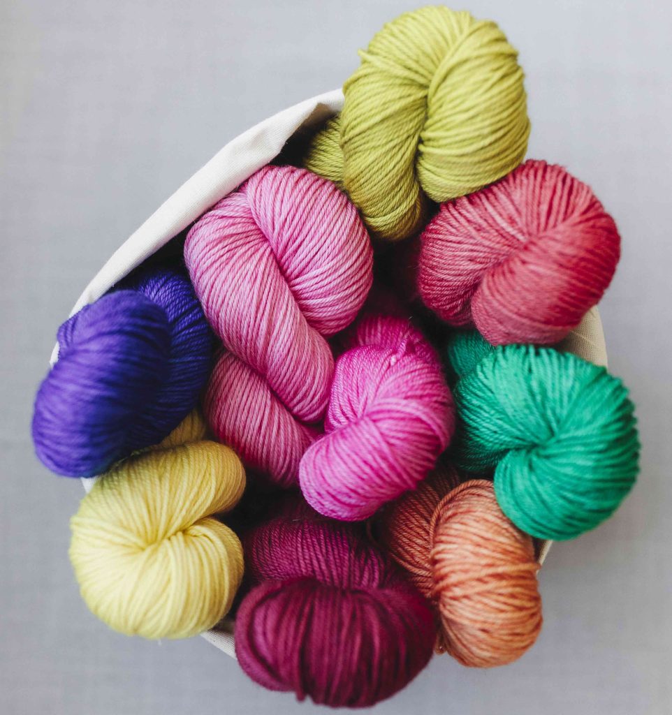
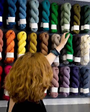
The one piece of feedback we receive consistently, from knitters across the world, is that people love our colour palette. Something about the lightness and brightness of our shades, and how we combine them, makes us unique.
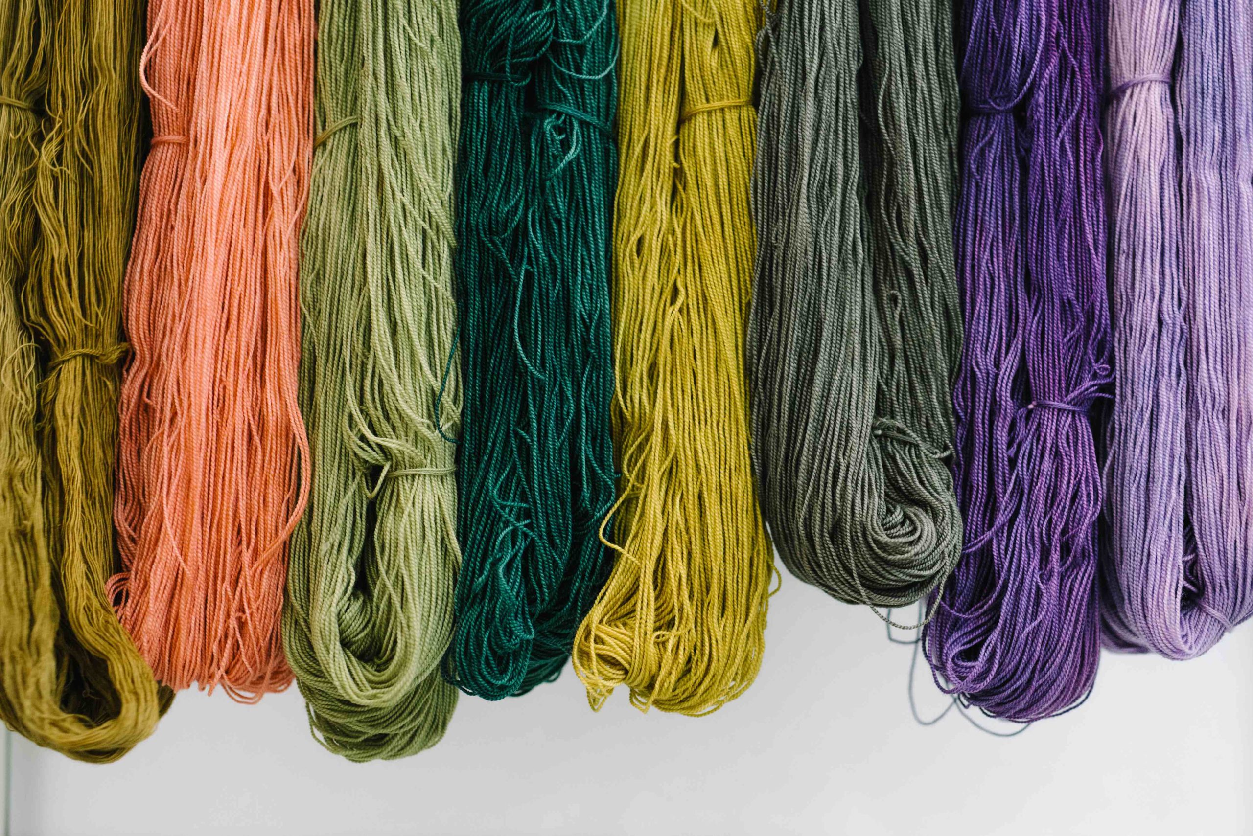
As we gear up to release ten new colours next month (yes, ten!), you might like a behind-the-scenes look at what goes into updating our palette. And who knows, maybe this will inspire you in choosing the colours of your next project.
Why our colour palette looks the way it does
When you’re a dyer, you pay attention to colour all the time, both consciously and subliminally. Despite that, what sets our colours apart from those of other brands isn’t intuitively obvious to me, because I think a lot of brands and dyers have great colours.
But when I think about it analytically, there are a few key elements:
– We contain our palette. We have a “one in, one out” approach, so we retire existing colours as we bring in new ones. This keeps our palette fresh.
– We acknowledge trends. Our new colour choices are informed by trends, particularly couture fashion. So our range always looks current. More on this below.
– We live in a warm weather climate and are surrounded by “summery” colours for most of the year. These tend to be brighter and warmer, with more of a red/yellow undertone than the bluey tones seen in Scandi design.
– We bring an unusual perspective. We’re one of the few yarn dyers based in the southern hemisphere that send our yarn to stores all over the world. I think our geographic conditions somehow make our colour perspective unique.
How to use colour trends (without being dictated by them)
People often ask about colour trends and whether they should pay attention to them.
I don’t believe trends should ever dictate our choices. But they’re a very useful tool. And trend data can help us think about certain shades in a fresh way.
When I was considering new colours, I looked at 2026 colour trends from forecasters, fashion sites, colour agencies, and Pinterest. Organisations like Pantone and WGSN will share information visually, which I love.
Here are Pantone’s colour palettes based on the Spring/Summer 2026 fashion weeks in NYC and London:
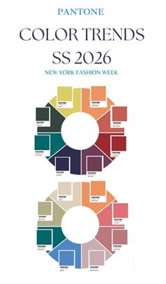
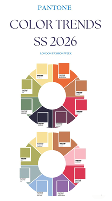
Side note: Thank goodness they have some colour in them – a far cry from Pantone’s 2026 Colour of the Year Cloud Dancer. White is not a colour!
WGSN is another reputable international forecaster. Here are some 2026 colour trends they’ve noticed:
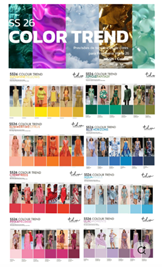
From just these two sources you can see common themes emerging. “Transformative Teal” (a deep bluey-green) pops up repeatedly. As do icy light blue-greens and vibrant yellow-oranges.
From colour trends to test batches
Once I’ve researched the forecasts I consider them in the context of Cowgirlblues – our existing colours, sales data, and gaps we want to fill.
We analyse sales patterns to see which colours are selling well and which aren’t moving, and this changes over time.
From this analysis, I earmark some colours for retirement.
Once I know what’s leaving, I look at our gaps.
Do we need more blues, neutrals, warm tones, pastels?
I’ll go back to the trend forecasts and consider which we could use to fill these gaps. Sometimes we’ve already covered the trending shades. But often the trends inform where we could add something new, and what specific shades to explore.
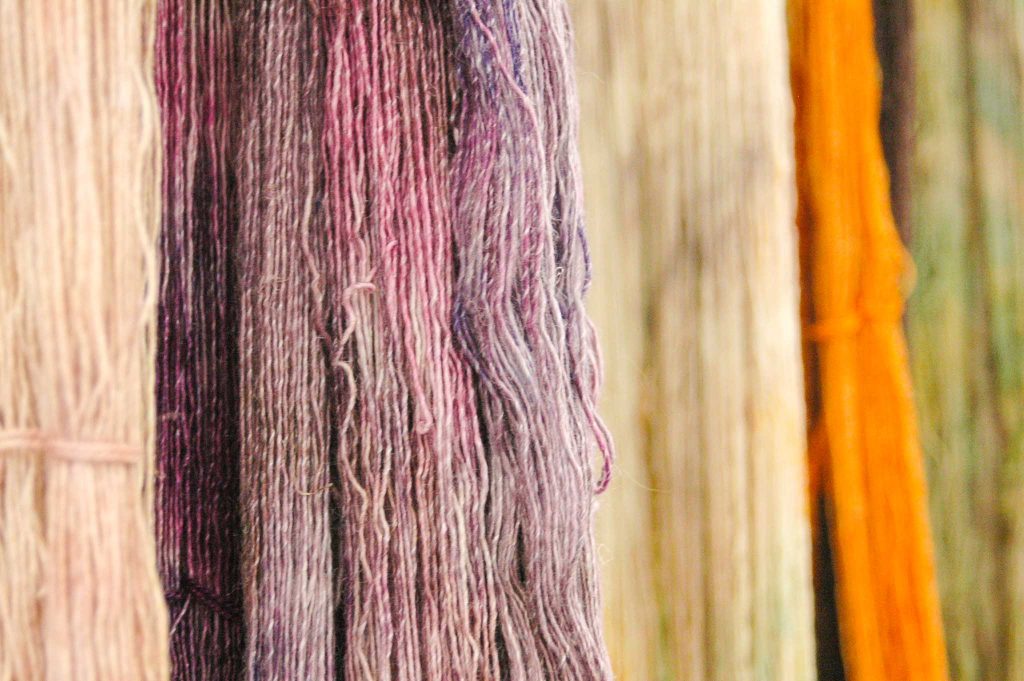
Next, we start dyeing test batches. This is fun, and tricky. Getting an exact shade can be difficult when hand dyeing.
Final decisions are based on what the yarn actually looks like when it’s dyed up in all the different yarn bases (merino, mohair, linen, etc.) so we can see how each colour behaves.
Once we have these samples, I like to see how people respond to them. We leave test skeins hanging around and watch which colours people gravitate to. And I ask studio visitors what they think.
The final step is coming up with colour names. It’s probably the hardest part of the process!
A sneak peek of our new colours for 2026
Well done for reading to the end. It comes with a reward.
Be the first to know the names of our new solid colours for 2026.
Only one of them is in the picture below …
High Tide. Low Tide. Saffron. Cacao. Champagne.
Keep watching this space for the full reveal in March…
If you’re looking for colour inspiration, here are some links to the forecasters I used for our new colours:
- WGSN SS26 (Video) https://www.youtube.com/watch?v=fY03yo5HlTg
- WGSN SS26 https://www.wgsn.com/en/blog/coloro-x-wgsn-introduce-key-colours-s-s-26
- WGSN AW 26/27 https://www.wgsn.com/en/blog/key-colours-w-26-27
- WGSN SS27 https://www.wgsn.com/en/blog/s-s-27-key-colours-have-landed
- Coloro AW27/28 https://coloro.com/key-colors
- Overview of 2026 colour trends https://wunderlabel.com/blog/p/color-trends-2026-pantone-coloro-fashion-weeks/