This February, we want to help you fall in love with colour.
Maybe it’s a first date with nervous jitters, maybe you’re already going steady. We’re all at different places in our colour confidence journey.
We often hear from our customers that they’re nervous to explore colour. This blog will dive into some foundational knowledge to take forward into your next project.
Colour confidence is a skill you can learn, step by step. It starts with understanding a simple tool that changes everything: the colour wheel.
Your new best friend: The colour wheel
For many, the colour wheel conjures up images of painters rather than knitters and crocheters.
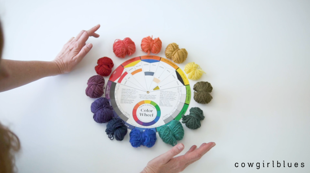
But, it’s a very useful tool for anyone playing with colour. The colour wheel gives us a framework to understand how colours work together. It tells us why certain combinations make your heart sing, and others just feel… off.
It’s very useful when planning and mixing colours at the start of a project.
The basics (we promise this is simple)
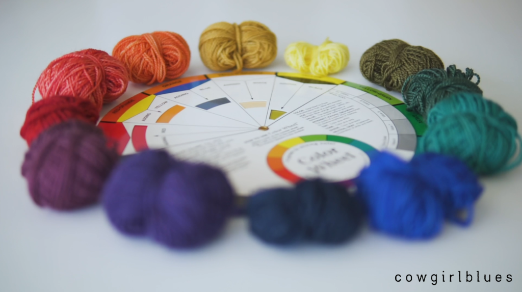
Every colour you see in our shop – from deep Rainforest to the brightest Karoo Gold – started with just three colours.
On the colour wheel, these are the primaries: red, blue, and yellow. They’re the building blocks of everything else. In the world of Cowgirlblues, these are Chilli Pepper, Cobalt, and Lemon.
If you mix two primaries together equally, you get a secondary colour. Orange, purple, and green.
The gorgeous in between shades are tertiary colours, like red-orange or blue-green.
Add varying amounts of black and white to any of these, and suddenly you have every shade imaginable.
See? Not so mysterious after all.
Colour and temperature
Here’s where the colour wheel becomes quite useful for planning your projects.
Imagine drawing a line down the centre of the colour wheel. On one side you have warm colours – reds, oranges, and yellows (I remember this by thinking sun = warm = red, orange, yellow) . On the other side are the cool colours – blues, greens and purples.
When you put a warm and cool colour side by side, the warm colour pop out and the cool colour tends to recede.
This matters more than you might think when planning your projects. If you’re using warm and cool colours and you want your design to feel balanced, you’ll typically need more of the cool colour. If you use equal amounts of each, the warm colour will dominate.
You can see this clearly in our Bonfire Tee. The warm Bette Middler is only used in the yoke, so it balances out the cool-toned Rainforest used in the rest of the body.
If you want to make the Bonfire Tee, there’s a project bundle ready for you on our website.
Complementary colours
Complementary colours are a good place to start for two-colour projects.
These are the colours that sit directly opposite each other on the wheel. Red and green. Blue and orange. Yellow and purple.
When combined in small amounts, complementary colours neutralize each other. They look muted and dull.
When sat side by side in bigger chunks, they intensify each other. Each colour becomes more vibrant and distinctive.
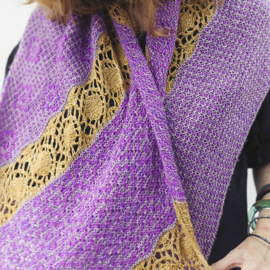
See how the colours pop in this Actinotus Wrap! If you want to play around with complementary colours, you can use the project bundle we’ve made for you here.
Your colour adventure starts here
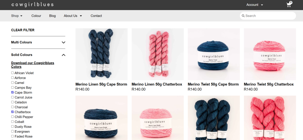
Now that you know the basics you can have fun. Go to our online shop and use the colour filter. Pick a colour you love and find its complement. Try a warm-cool combination. See what tertiary shades make your smile. If you haven’t used the filters on our website before, watch this tutorial we made.
Falling in love with colour isn’t about knowing all the rules. It’s about giving yourself permission to experiment and trusting how the colours make you feel.
Don’t be afraid to swatch and swatch again until you discover what speaks to you.